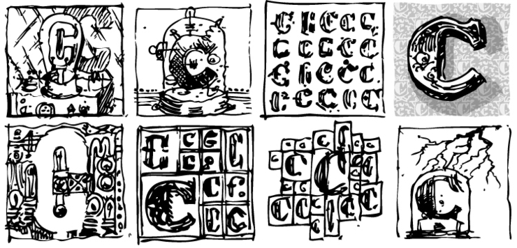
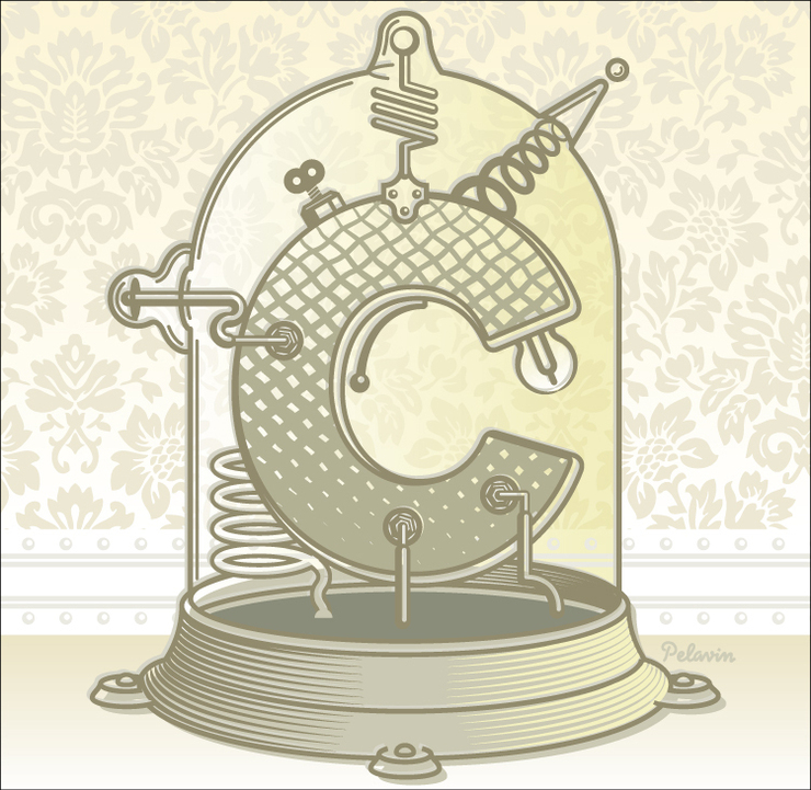
A while back, I was surprised and honored to be part of an exhibition called Letter as Image/Image as Letter, which was held both in Los Angeles and New York and included artists who have long been heroes to me. The premise was the blurring of the line between typography and illustration and how the two are combined to enrich and deepen the experience of content and communication. I have to admit, I never really make a conscious effort to integrate the two as much as they seem to evolve naturally from the assignements I get. As case in in point is this recent ilustration for a review in the Wall Street Journal of a book with a title consisting of the single letter "C."
That title, along with the themes of invention and technology in Victorian times, presented an ideal opportunity to incorporate my love of letterforms with my delight and obsession with strange electrical and mechanical devices.
Having been given the job on a Wednesday evening withg a due date of Thursday afternoon, I was relieved of the problem of too much time for procrastination. I managed to get the art finished within about 3 minutes of the drop-dead deadline and benefitted from too little time to overthink and overwork a simple concept.